File:Figure 3.22 - Hemispheric phase diagrams for temperature versus ice core proxies for westerlies.png
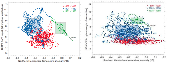
(Left side) Phase diagram for Northern Hemisphere temperature versus ice core proxy for Northern Hemisphere westerlies (shown in Figure 3.21, light lines). (Right side) Phase diagram for Southern Hemisphere temperature versus ice core proxy for Southern Hemisphere westerlies (shown in Figure 3.21, light lines). Red dots are data from 800–1400 AD, blue dots 1401–1930 AD, and green dots 1931–1985 AD. The shaded red, blue and green boxes represent the mean ± one standard deviation of the data for each these time periods, respectively. The black arrow labelled 1980–1985 highlights data for the last 5 years of the record. Note that recent decades of westerlies in both hemispheres are within range of variability of the Little Ice Age (blue dots) although westerlies in Northern Hemisphere as of late 1980s are approaching Medieval Warm Period (red dots) conditions. Figures from Mayewski and Maasch (2006[1]).
- ↑ Mayewski, P.A. and Maasch, K. 2006. Recent warming inconsistent with natural association between temperature and atmospheric circulation over the last 2000 years. Climate of the Past (Discussions) http://www.copernicus.org/EGU/cp/cpd/2/327/cpd-2-327.htm.
File history
Click on a date/time to view the file as it appeared at that time.
| Date/Time | Thumbnail | Dimensions | User | Comment | |
|---|---|---|---|---|---|
| current | 15:31, 6 August 2014 | 540 × 203 (107 KB) | Maintenance script (Talk) | Uploaded by import script |
- You cannot overwrite this file.
File usage
The following page links to this file: